A brand of recycled and resistant chopsticks that allows the customer to be more respectful with the environment.
Work environments
Branding
Packaging
3D
Sales point
Pop up
Branding
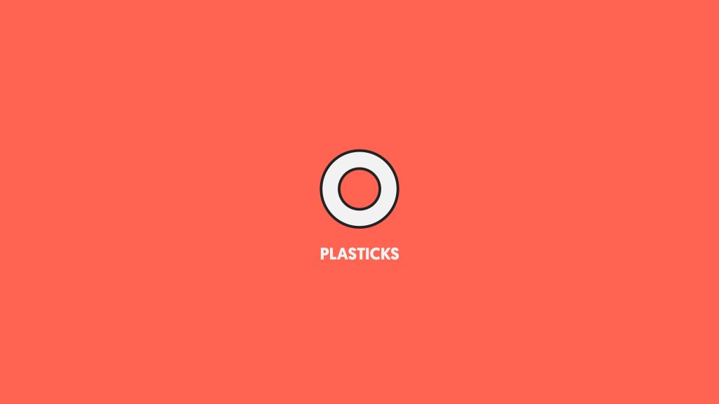
Plastiks is a sustainable and simple brand, which is why we wanted to create a brand accordingly. We developed a minimalist identity that focused on the chopstick. The entire design of the brand is based on following the minimalism of Chinese design.
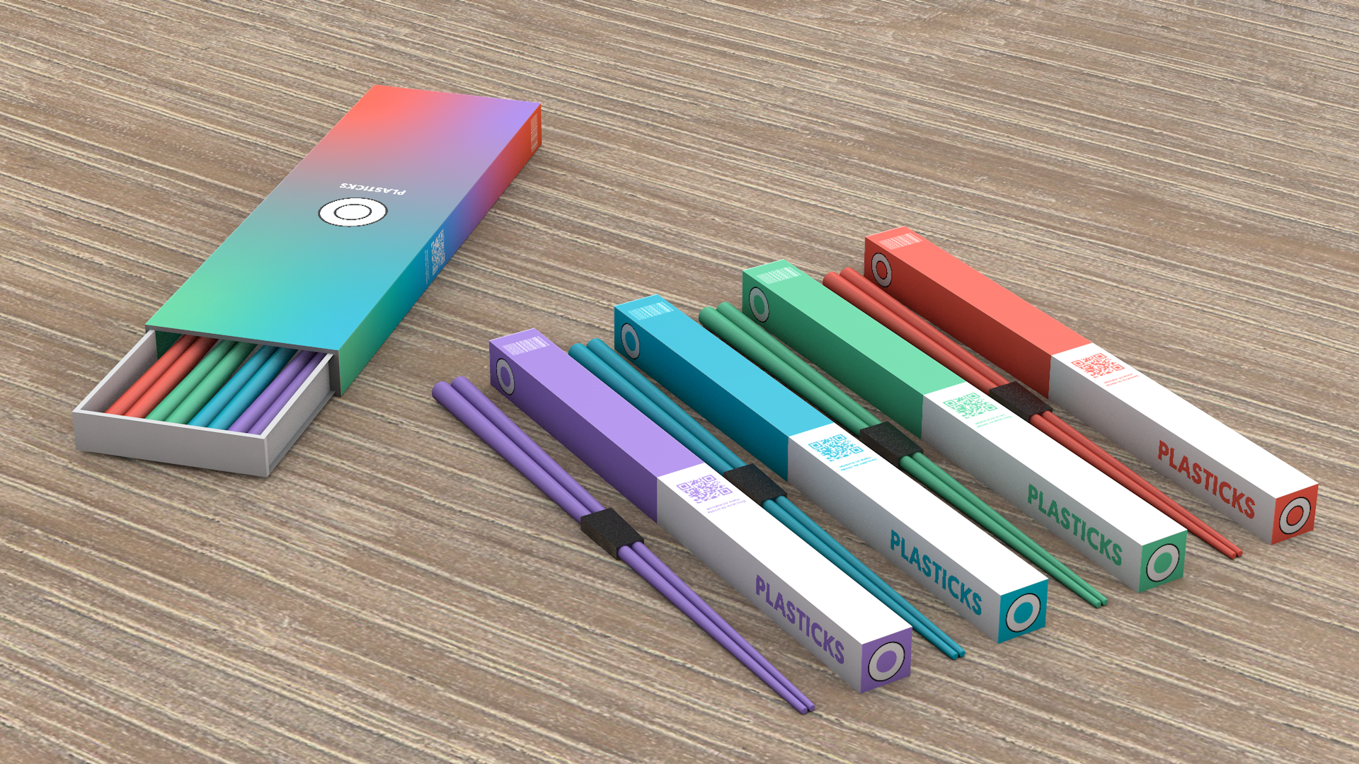
For Plastiks we wanted to create functional and visually attractive packaging. Each color refers to a different recycled material, in this way the customer finds and chooses the chopsticks that most interest him. But we have also created a packaging for those who want to buy all the variations in one purchase.
Sales point
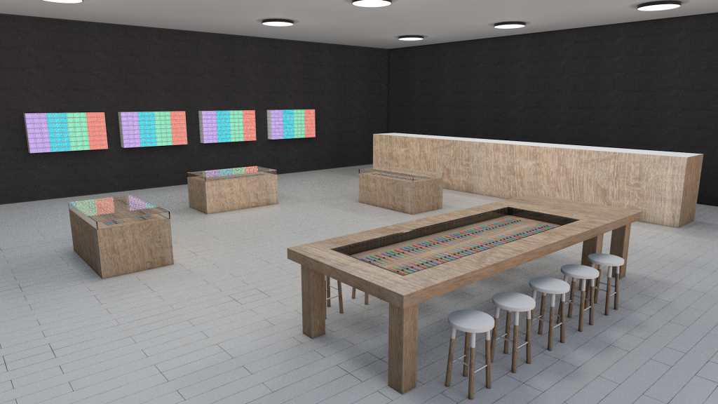
The visual design of the stores follows the minimalist aesthetic of the brand. But we have created a differential shopping experience in them, since we will have a sushiman making sushi in live which you can eat trying our chopsticks before buying them.
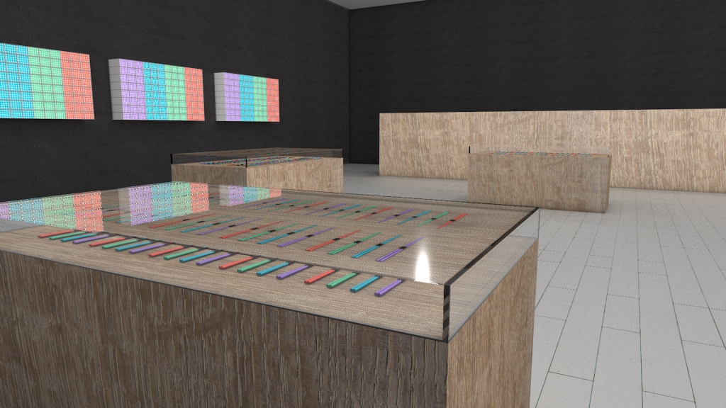
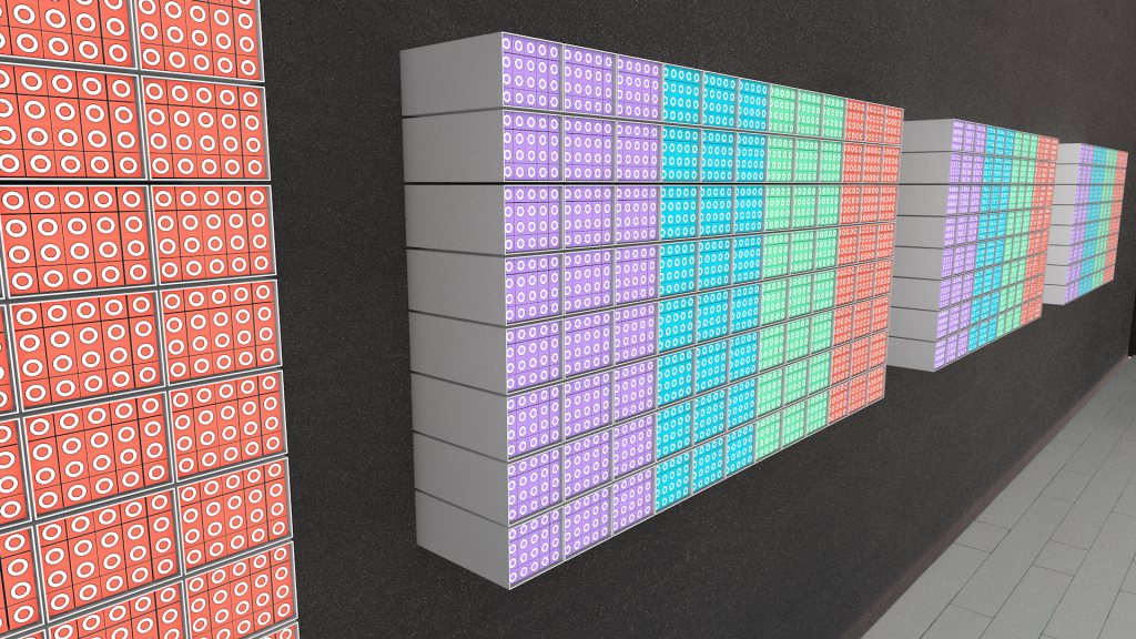
In the store we can see that the focus is on the product thanks to glass showcases and color-separated panels, thus avoiding adding elements that detract from the product’s visibility.
Pop up
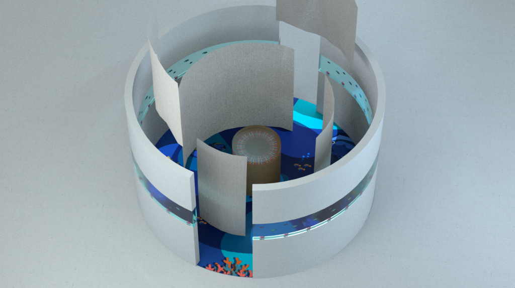
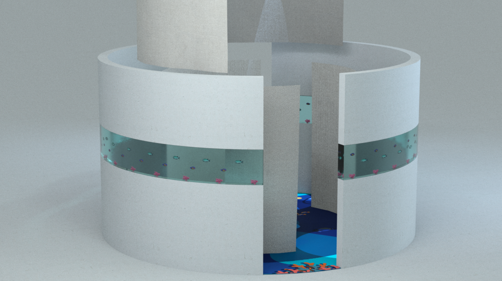
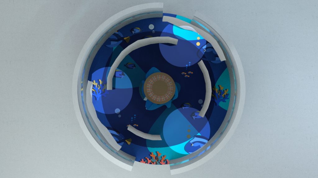
We wanted to create a Pop-up store with which we can attend fairs or events in which we can make ourselves known. It has a circular route in which we force the client to visit the entire stand, with promoters who explain what it is about.
The Pop-up focuses on the sea for two reasons, the first is that our recycled materials are rescued from the sea and the second reason is that chopsticks are normally associated with foods that contain fish. The design is very striking to get people to come closer, once there we show them our product as a central element.